
A Markdown design specification template you can preview and download
Download a complete workspace settings design specification, edit it in Markdown preview, and reuse its tokens, component states, responsive rules, and acceptance checklist.
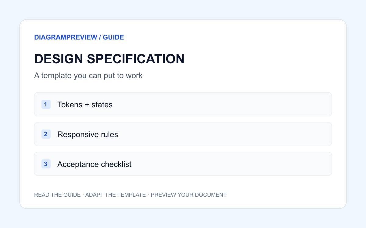
A useful specification describes decisions
A screenshot can show a button, but it cannot fully explain when that button is disabled, what happens during a request, or whether a failed request keeps the user’s draft. A useful specification makes those decisions visible to designers, developers, and AI assistants.
This independent DiagramPreview template describes a workspace settings form. It is ordinary Markdown you can adapt for a repository, review document, or Figma Specs workflow. It is not an official Figma template, an automatic import format, or a promise of exact rendering compatibility.
Open, edit, or download the full example
Open the template to load this exact source into DiagramPreview’s existing Markdown editor. Change the project name, behavior, and design rules, then inspect the rendered headings, lists, and checklist. The download below contains the same source.
The preview link carries example text in its URL fragment. If you later share a link containing your edited source, anyone receiving that link can read that source. Remove private project details before sharing.
To adapt the rules through a form, open the specification generator, fill in goals, tokens, component states and acceptance criteria, then edit, preview and download the Markdown. Run the completeness check to see text evidence or suggestions for states, named tokens, keyboard behavior, responsive constraints and acceptance items. Adapt the optional Mermaid example separately and open it in the existing SVG/PNG exporter; matching text is not proof of correct implementation.
# Workspace settings — design specification

> Independent DiagramPreview example. Adapt the rules to your product; this is not an official Figma template or import format.

## Purpose and scope
Let a workspace owner update the workspace name and notification preference.
Non-goals: billing, team invitations, and permission management.
Use synthetic preview data; do not connect a production backend for this example.

## Design tokens
- Primary action: #1D4ED8 with white text.
- Body text: #0F172A on #FFFFFF.
- Muted text: #475569; error text: #B91C1C.
- Typeface: system-ui; body 16px / 24px; heading 24px / 32px.
- Spacing scale: 4, 8, 12, 16, 24, 32px. Card radius: 8px.
- Use named tokens instead of adding arbitrary colors or spacing.

## Components and states
### Save button
- Default: label “Save changes”; primary background.
- Hover: use #1E40AF; retain readable white text.
- Focus: visible 2px outline with 2px offset.
- Disabled: when unchanged or invalid; explain field errors beside inputs.
- Loading: label “Saving…”; prevent duplicate submissions.
- Success: announce “Changes saved” in a live region.
- Error: show an inline message and allow retry; preserve edited values.

### Workspace name
- Required, 2–60 characters after trimming surrounding whitespace.
- Persistent visible label and helper text; placeholder is not a label.
- Validate on blur and before saving; associate errors with the input.
- No changes are persisted when validation fails.

## Interaction and data
1. Load the current name and notification preference.
2. Allow editing; enable Save only for valid changed values.
3. On submit, show the loading state while a simulated request runs.
4. On success, keep the confirmed values and announce completion.
5. On failure, retain the draft and offer retry.
- Initial loading: show a labeled loading placeholder.
- Initial request failure: show a retry action; do not fabricate saved data.
- Empty name from the server: show the required-field message before saving.

## Responsive layout
- Below 768px: one column, 16px page padding, full-width save button.
- At 768px and above: centered form, maximum width 640px, 24px padding.
- At 320px viewport width: no horizontal page scrolling.

## Accessibility
- Every input has a programmatic label; tab order follows visual order.
- All interactive elements work by keyboard and have visible focus.
- Error and success states use text, not color alone.
- Verify normal text contrast at least 4.5:1 against its actual background.

## Acceptance checklist
- [ ] Blank or whitespace-only names cannot be submitted.
- [ ] Names outside 2–60 characters show a specific error.
- [ ] Repeated clicks during saving produce only one request.
- [ ] A failed save preserves edits and supports retry.
- [ ] A successful save announces completion without moving focus.
- [ ] Keyboard and 320px mobile checks pass.
- [ ] Every implemented state matches this specification.

## Decisions before production
- Confirm the real endpoint, authorization rules, and error responses with engineering.
- Confirm notification behavior and final copy with the product owner.
- Replace simulated requests only after the data contract is approved.
Adapt the rules to your product
Replace the example’s scope first. A billing form, an invitation flow, and a notification settings page have different permissions and failure modes. Delete states that do not apply and add the ones your real workflow needs.
Next replace colors, typography, and spacing with your existing design tokens. Include where each token is used: a hexadecimal value alone does not tell an implementer whether it belongs to a background, border, or error message.
Keep unresolved decisions separate from approved rules. The example deliberately leaves the production endpoint and authorization contract for engineering to confirm. An assistant should report those gaps rather than inventing a backend.
Give an AI assistant a bounded request
Attach the edited specification and the relevant design or component references. Ask for one screen and state the boundaries explicitly. The following prompt is a starting point; it does not rely on any particular AI vendor.
Build a workspace settings prototype using the attached specification.
Reuse the named tokens and existing components.
Implement default, loading, success, error, and disabled states.
Use synthetic data and simulated requests only.
List unresolved decisions instead of inventing API or authorization rules.
Report each acceptance item as demonstrated, missing, or requiring human review.Verify the result against the acceptance checklist
Run the invalid-input, repeated-submit, network-failure, and success paths yourself. Compare each observed result with the corresponding checklist item. A generated report is useful context, but it is not evidence that the prototype was tested.
Review keyboard focus and the narrow layout as well as the happy path. Record what was observed, where it was checked, and which decisions remain open. Keep the specification next to the implementation so later changes can be reviewed against it.
Add diagrams when the flow needs them
For a single form, numbered interaction steps may be enough. For branching approvals or multi-service behavior, add a separate flowchart or sequence diagram and link it from the specification.
DiagramPreview supports Mermaid in its own Markdown workflow. That does not establish native Mermaid support in Figma Specs. For a Figma handoff, verify the accepted embed or image workflow and keep the diagram source separately for future editing.